Overall JSON extraction
Best for schema-driven workflows.
Nobody buys a document AI tool in general; they buy it for invoices, payslips, lab reports, or dense registers. So the 72 documents are grouped into the families people actually run, and each family is scored on its own. The overall leader does not win every one of them. This view compares the specialized extraction platforms; the three frontier LLMs called directly are ranked on the rankings page.
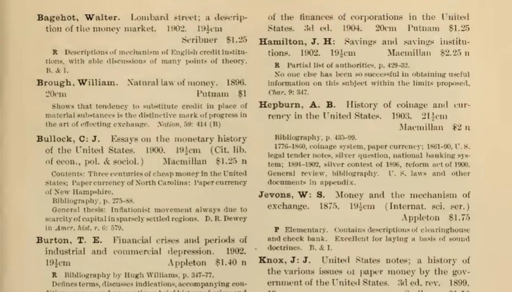
A single scanned page here can hold hundreds (sometimes a couple thousand) of short, near-identical entries: dictionary headwords, directory listings, ship registrations, auction lots, price-list rows. The hard part is not reading any one line, it is getting through all of them faithfully, without inventing an entry, merging two, or quietly stopping partway. This is the use case that separates document tools the most, because it rewards stamina and discipline over raw comprehension.
The most common way to fail is not to misread but to not finish. A system that transcribes the first few hundred entries perfectly and then runs out of room, or abandons the page once the output grows long, still fails the document, because completeness is the whole task. Approaches that produce the answer in one long uninterrupted pass are the most exposed to this; the ones that hold up are built to work a page in pieces and keep going until the entries run out.
The second pitfall is brittleness to layout and script. Tools tuned for clean, ruled tables do beautifully on a telephone book or a vessel register, where every row is a grid, then fall apart on prose-style entries (a dictionary definition, an annotated catalog note) where the structure lives in the typography rather than in lines. Non-Latin scripts widen the gap: right-to-left columns, Devanagari, and vertical microfilmed CJK all have to be segmented before a single character can be transcribed, and it is here that most of the field quietly gives up.
So what separates the top of the board is consistency, not a high score on the easy documents (anything can read a clean register). The systems that win are the ones that do not collapse when the page gets long, the script gets unfamiliar, or the scan gets degraded.
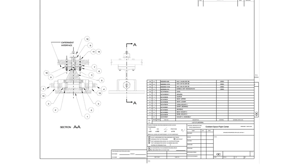
The grab-bag: agreements, an engineering drawing, receipts, a census schedule, and a handwritten weather form. There is no single layout, which is the entire point of the family, and it produces the widest spread of scores anywhere on the board.
Two edge cases dominate the failures, and they often arrive together: handwriting and rotation. A printed form is one thing; a cursive field written by hand, on a degraded scan, turned on its side, is close to the worst case a document tool will ever face, and it is exactly the kind of input that real archives are full of.
Layout variety is the quieter challenge. An engineering drawing hides its data in a title block and a web of annotations; a receipt crams it into a narrow thermal-printed strip; a census schedule spreads it across a wide ruled grid. A tool tuned for any one of these has to generalize to all of them, and many do not.
So this family rewards breadth over polish. A system that is only good at clean printed forms will handle the drawing and the agreement and then fall apart on the handwriting; the ones that lead are the ones that degrade gracefully across the whole mix instead of excelling on part of it and collapsing on the rest.
This is also the closest proxy on the board for the documents most companies actually struggle with. Very few businesses are held up by invoices; they are held up by the one internal form, the scanned appendix, or the handwritten log that does not look like anything else in the pipeline. A tool's behaviour here says more about how it will handle your awkward documents than its overall average does.
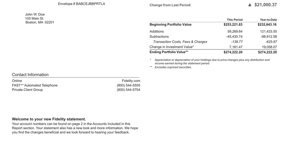
Statements are long runs of transactions, sometimes stretched across many pages, where every row is a date, a description, and an amount, and a running balance is supposed to tie out at the bottom. The individual rows are easy; the length is not.
The defining failure here is the page break. A statement that straddles pages invites a tool to drop the last row of one page or repeat the first row of the next, and a single duplicated or missing transaction breaks the reconciliation even when every character was read correctly. The longer the statement, the more page boundaries there are, and the more chances to lose or double a row.
Description columns make it worse. Transaction memos wrap across lines, merchant names get truncated, and a tool has to decide where one transaction ends and the next begins. Get that boundary wrong and two transactions merge into one, or one splits into two, and again the totals stop matching even though nothing was actually misread.
So what separates the field is discipline across the page boundary and the wrapped row, not raw legibility. On a short, well-ruled statement even the models called directly do well; the gap opens on the long, multi-page ones, where a tool has to keep its place for hundreds of rows without losing count.
Format matters as much as length. A transaction register exported as a spreadsheet or a delimited file is close to trivial, since the rows are already rows, while the same data as a scanned statement has to be rebuilt from ruled lines and whitespace. If most of your statements arrive as PDFs from a bank portal rather than as clean exports, weight the long scanned cases far more heavily than the tidy ones.
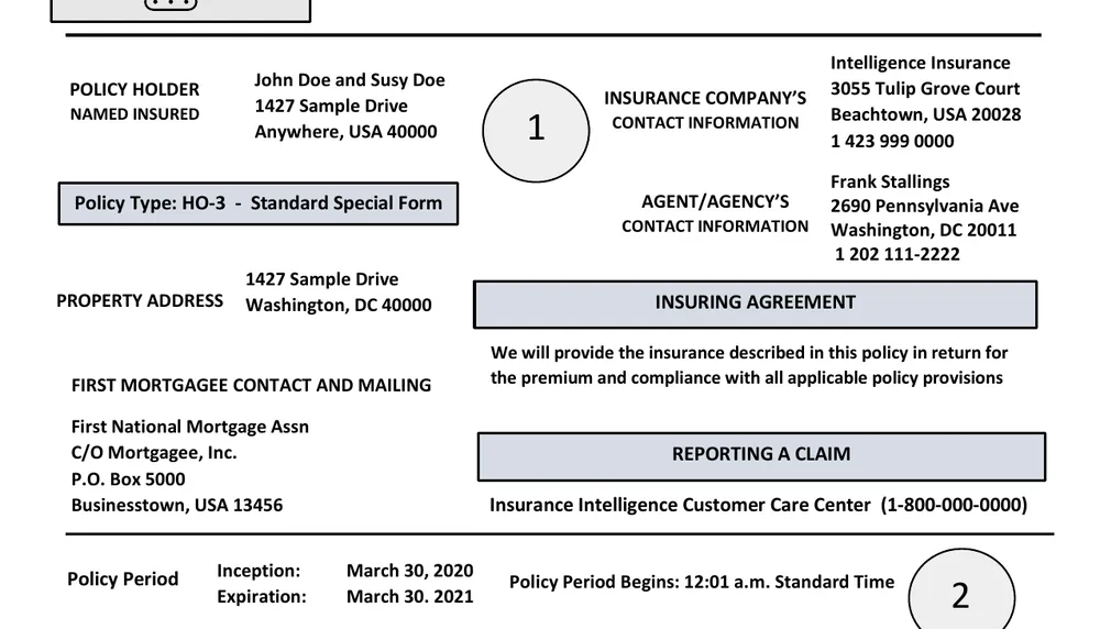
Declarations pages and a property appraisal, dense with named parties, coverage limits, deductibles, and dollar figures that reference one another across a single crowded page. The information is not hard to read; there is simply a lot of it packed into a small space.
With only three documents this is the smallest family on the board, so it should be read as a signal rather than a ranking. It is here to make sure the coverage of everyday business paperwork is honest, not to crown a winner, and the scores are uniformly high enough that no tool embarrasses itself.
The genuine difficulty, when it shows up, is reconciliation. Coverage amounts, limits, and deductibles have to be pulled out precisely and tied to the right coverage line, and a declarations page lists several coverages with similar-looking numbers. Attach the right figure to the wrong coverage and the extraction is worse than useless, because it reads as authoritative and is quietly wrong.
So the honest read is that everyone handles a declarations page, and the small differences that exist come down to keeping each figure attached to its own coverage. The family rounds out the picture of common business documents rather than stress-testing the tools.
If this were a family worth ranking it would need more carriers and more document types: auto and commercial policies, endorsements, claims correspondence, and appraisals from several vendors, each with its own house layout. Until then the fair statement is that declarations pages are within reach of every tool tested, and anyone buying for an insurance workflow should run their own carriers' forms before drawing conclusions.
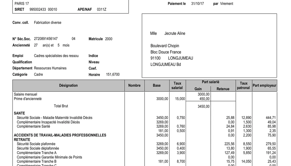
Fixed-layout forms, a payslip or a tax form, where the fields sit in known boxes and the main variable is the language the employer prints them in. The structure barely moves from one document to the next, so on the surface this looks like a solved problem.
The classic trap is the deduction line: the negative or storno row where an amount is subtracted rather than added. Its sign, or a trailing minus printed after the number rather than before it, is easy to drop, and a payslip where a deduction is read as a credit is wrong in the way that matters most to the person holding it.
Multilingual labels add a second layer. The box is in the same place on a Hebrew, German, Italian, or French payslip, but the tool still has to recognize what the local payroll term means to map it to the right field. A gross-pay line and a net-pay line look identical structurally; only the label tells them apart, and only if the tool can actually read it.
The field is tightly bunched here, so the outcome comes down to sign handling and label mapping rather than raw reading. Nobody is confused by the layout of a payslip; tools differ on whether a deduction lands with the correct sign and against the correct heading.
That makes payroll a good early automation target and a deceptive one. The volume is high and the layout is stable, so the return arrives quickly, but the errors that do slip through are arithmetic rather than textual, and an arithmetic error on a payslip tends to be found by the employee before it is found by the system.
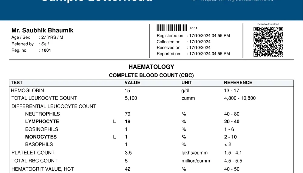
Discharge summaries, lab panels, and schedule sheets: a mix of free-text narrative and small, tightly structured tables. A lab panel in particular is not really a form at all but an array, a repeated set of test name, value, unit, and reference range, wrapped in a bit of prose.
Because the documents are short and mostly clean, this family does not separate tools much on reading ability; nearly everyone clears it. Where it bites is the shape of the output rather than the perception of the page.
A nested array, a panel of results, or a list-shaped field such as a set of medications trips tools that expect flat, one-value-per-field output. They will read every value correctly and then flatten it, collapsing a structured panel into a blob of text, which loses exactly the structure a downstream system needs. The failure is architectural, not visual, and it does not show up until you look at the output shape.
So treat this as a signal rather than a ranking. There are too few documents to rank confidently, and the scores sit so high that the real question is not who can read a lab report but which tools return nested and list-shaped data without flattening it on the way out.
It is also the family where the schema deserves more attention than the model. Clinical data is naturally nested, a panel inside a report inside an encounter, and the cost of getting that shape wrong is paid downstream by whatever has to consume it. If you are testing on healthcare documents, inspect the structure of the output, not only whether the values are right.
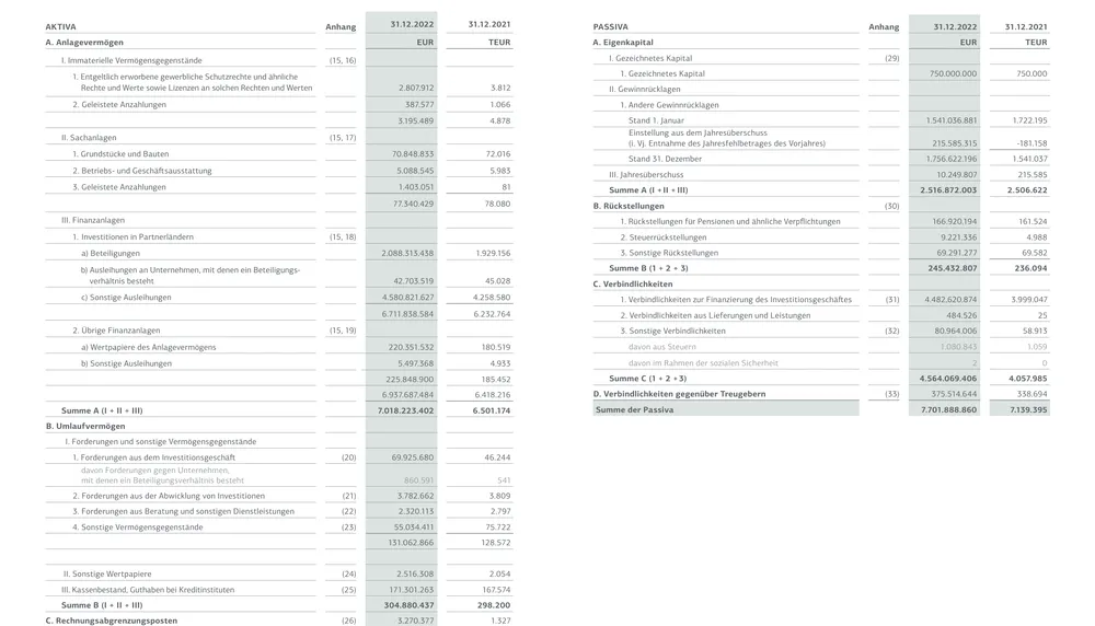
Balance sheets, profit-and-loss statements, and municipal accounts, most of them in a language other than English, where the numbers live in nested, hierarchical tables and the column that matters can sit on the far right or the far left depending on the script. This is the hardest family on the board, and it is hard for two independent reasons.
The first is structure. These tables are hierarchical, not flat: line items roll up into subtotals, which roll up into totals, and a figure only means something in relation to the level above it. A tool that reads every cell but flattens the hierarchy captures all the numbers and loses all the relationships, which for a set of accounts is most of the information.
The second is script and direction. Non-English, often right-to-left layouts invert the reading order, so a system tuned for left-to-right can pair a label with the wrong figure, or read a parenthesized negative as a positive. Statutory formats also differ country to country, so the same concept lands in a different place on a German, Portuguese, or Hebrew statement, and a tool has to find it rather than expect it.
It is close at the top, and tellingly the two leaders finish level here: a specialized competitor matches the overall leader point for point rather than trailing it. That is the honest signal that this family is genuinely difficult rather than a formality, and the one place on the board where the top is a tie rather than a lead.
For anyone evaluating tools on accounts, the practical advice is to test on your own jurisdiction rather than on an English sample. A tool that handles a US filing gracefully can still stumble on a municipal budget in Hebrew or a statutory Dutch return, and the difference does not surface until the layout, the language, and the hierarchy all change at once.
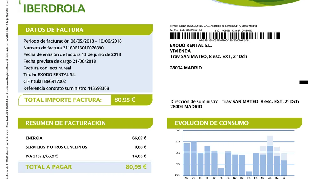
This is the most standardized document there is: a header, a party block, a table of line items, and a total that has to reconcile to the sum. Because the shape is so well understood, almost every tool reads a clean English invoice cleanly, which is exactly why this family is decided at the edges rather than in the middle.
The first thing that separates tools is the line-item table. Real invoices carry a variable number of rows, some with sub-lines, discounts, or tax applied per line, and the extracted total has to tie back to those rows. A tool that reads each line correctly but mishandles a discount or a per-line tax produces a document that looks right and reconciles wrong, which on an invoice is the failure that matters.
The second is language. The same layout printed in Spanish, Arabic, or Japanese asks the tool to read right-to-left, or top-to-bottom, or to recognize a tax label it has never seen. A system can nail an English utility bill and still transpose a figure on an Arabic tax invoice, or pair the wrong label with a number on a vertical Japanese one, because the reading order itself has changed.
So the ranking here is not about who can read an invoice, everyone can. It is about who stays clean on the multilingual and reconciliation cases once the format stops being familiar, and that is a much shorter list than the one that handles a plain English bill.
It is worth separating the scanned invoice from the structured one. A machine-readable e-invoice, an EDI message or a UBL file, carries its fields explicitly and is close to free to parse correctly, while a photographed or faxed bill has to be reconstructed from pixels. Buyers who receive both should be careful not to judge a tool on the easy half of their mail.
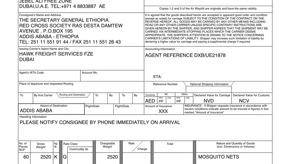
Waybills, packing lists, purchase orders, and an EDI message: semi-structured forms with a fixed set of fields, shipper, consignee, weights, piece counts, scattered around a printed template. The vocabulary is small and the fields are predictable, which makes the reading itself fairly forgiving.
The interesting failure here is orientation. Scanned waybills arrive rotated, sometimes ninety or a hundred and eighty degrees, because whoever fed the scanner did not stop to straighten the page. A tool that assumes an upright document can read a sideways one as noise unless it first detects the rotation and corrects it, and the ones that skip that step fail an otherwise trivial form.
Scan quality is the other variable. These are working documents, faxed, stamped, photocopied, and folded, so the same waybill can arrive crisp or nearly illegible. The layout does not change, but the contrast and the artifacts do, and a tool that leans on clean edges to find its fields struggles when the edges are gone.
This is one of the few families where a model called directly tops the board, because a clean, boxy trade form plays to a general model's strengths once the page is turned the right way up. The gap only appears on the rotated and degraded scans, where handling the image matters more than understanding the form.
In practice that is a good argument for testing with your own scans rather than clean vendor samples. Trade documents are handled by people in a hurry, and the copy that reaches your pipeline is the one that came off a shared scanner at a warehouse, not the pristine template the carrier publishes.
These slices cut across the families above: the same 72-document run, regrouped by what the document demands rather than what industry it comes from. Every document in each slice is open to inspect.
Best for schema-driven workflows.
Best for repeated rows and totals.
Best for production edge cases.
A high overall score matters, but the right buying decision depends on the document families that match your workflow.
Prefer the rank tied to the output shape you need: flat fields, nested data, or repeated rows.
Look for wrong-row errors, missing line items, unsupported extra values, and hallucinated fields.
Compare tools on the same run date so product changes do not mix old and new behavior.
Compare only configurations that cover every document in the current set, so missing hard cases cannot inflate the average.